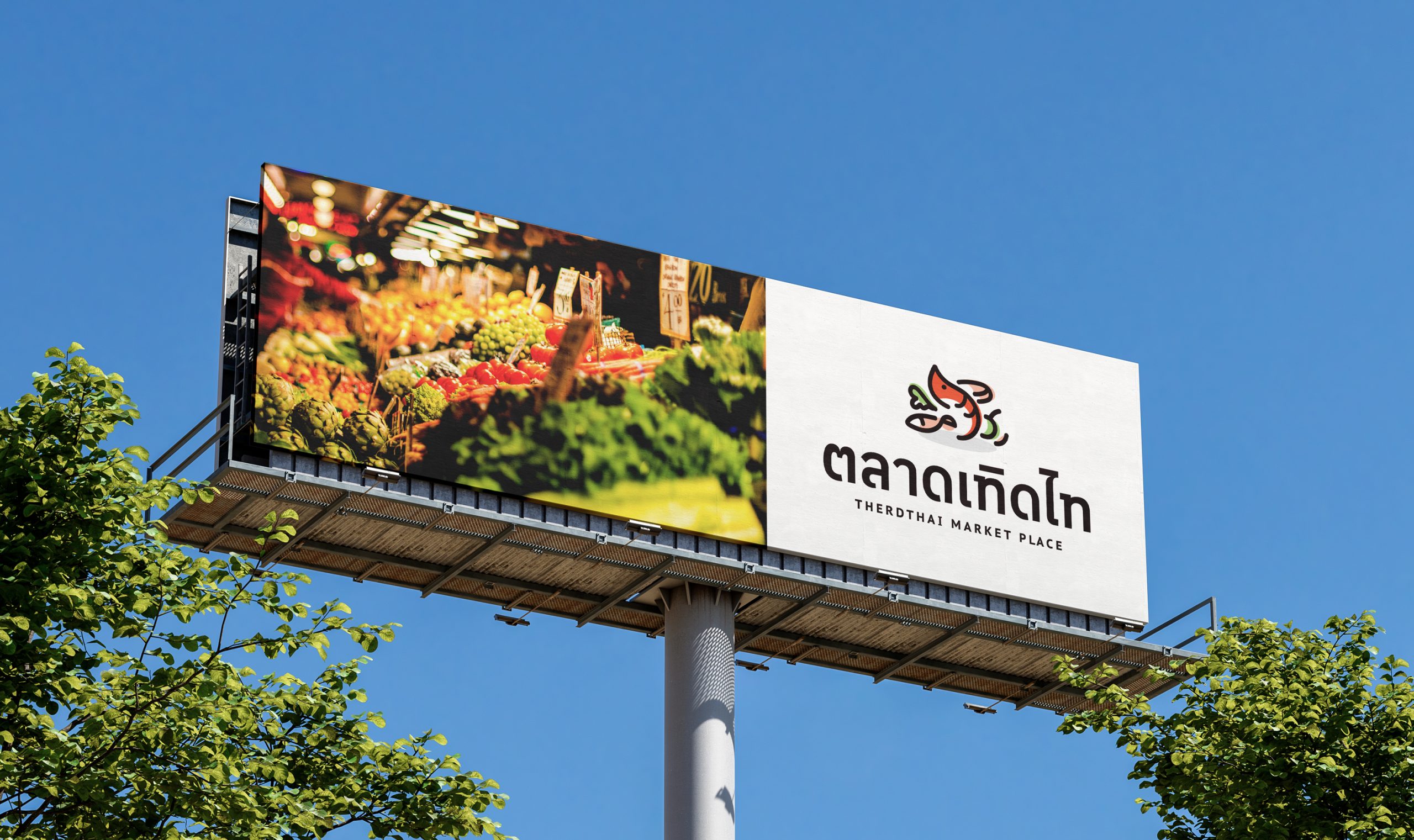
The logo has been designed in the form of a combination mark, consisting of both a symbol and text that incorporates the full name of the brand, creating a distinctive identity. It clearly conveys the essence of the market's diversity, with symbols representing various market products such as shrimp, fish, vegetables, fruits, and meat, arranged in a non-linear manner to appear diverse and fresh, almost natural. The overall impression of the logo evokes a sense of friendliness, ease of understanding, and accessibility, portraying a market abundant with diverse and always fresh ingredients. Additionally, the choice of "Tangerine Orange" color signifies creativity and the power of happiness, reflecting the intention of the Tid Thai market to be a center for spreading goodness to people continually.


Leave a Reply
You must be logged in to post a comment.