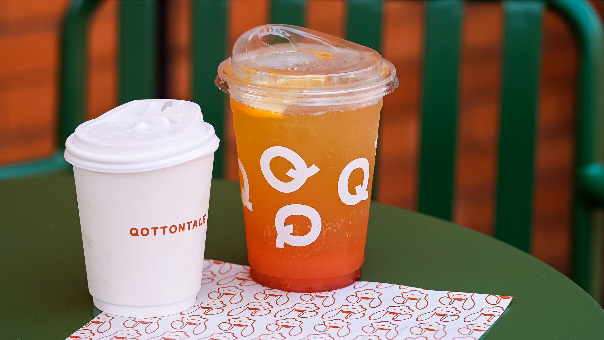
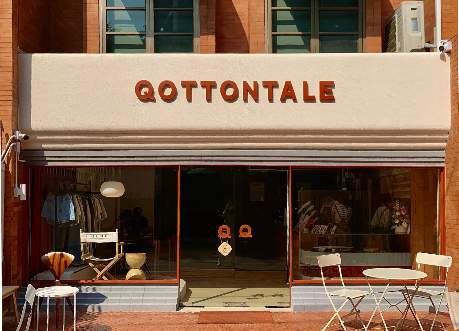
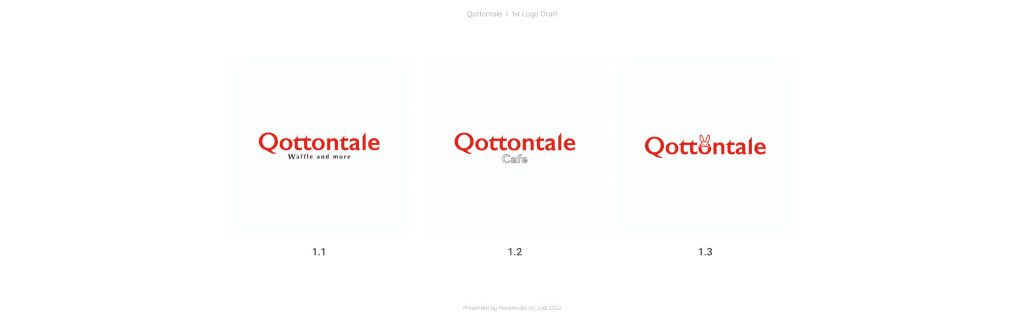
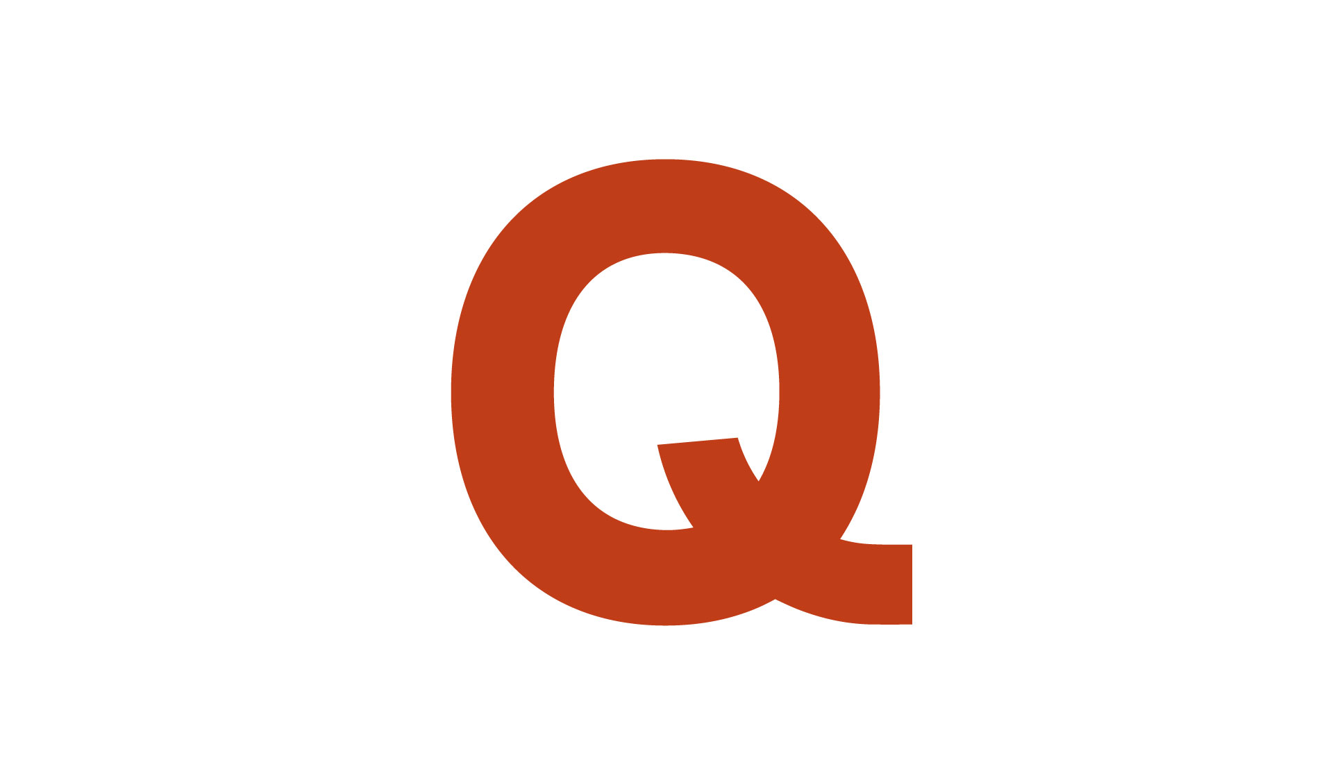
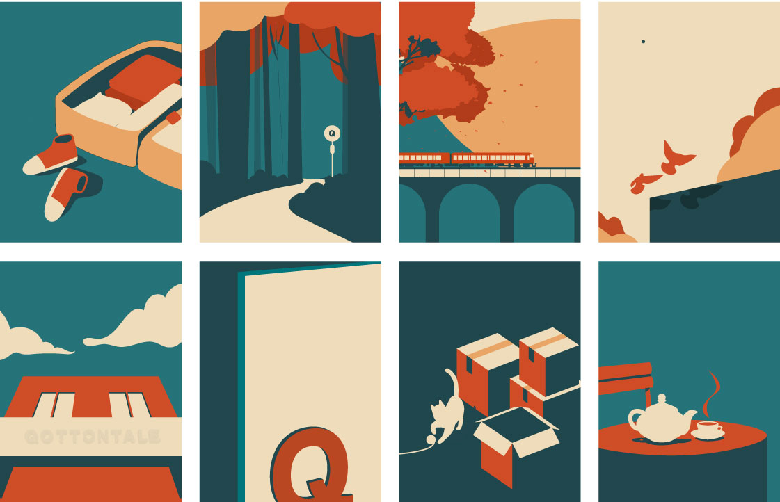
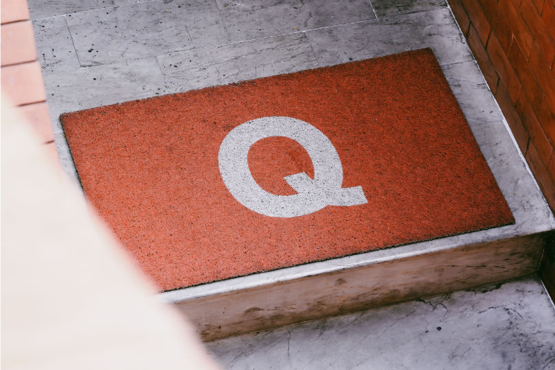
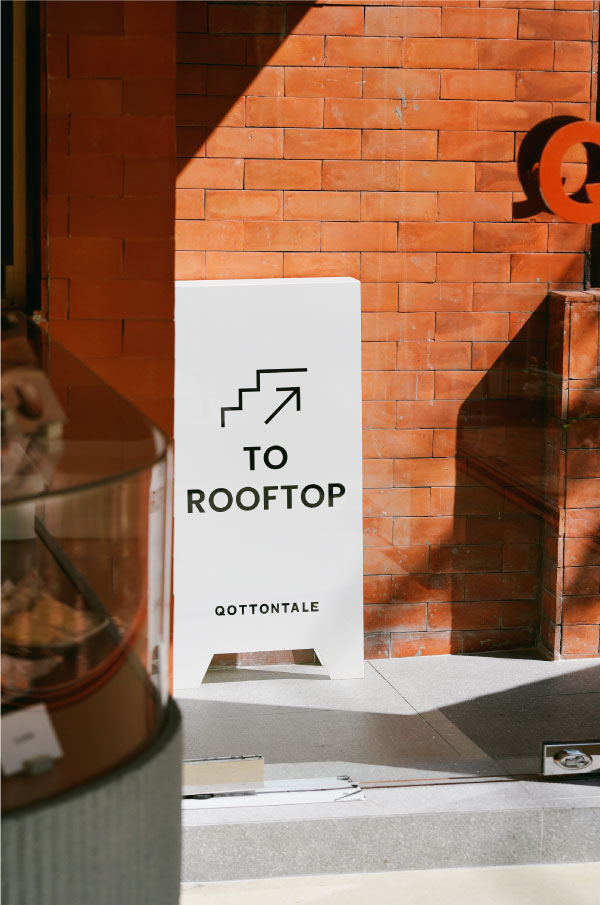
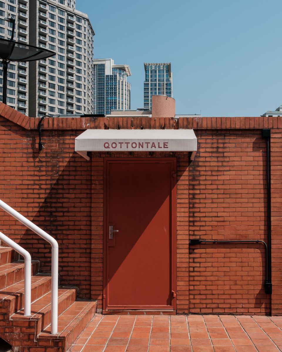
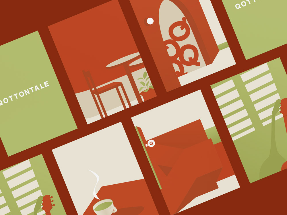
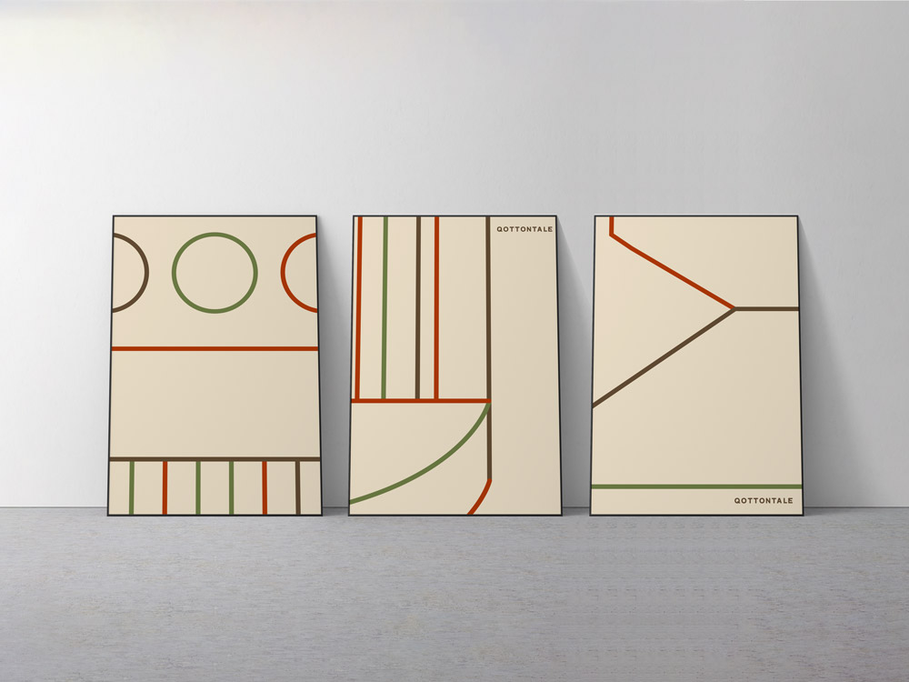
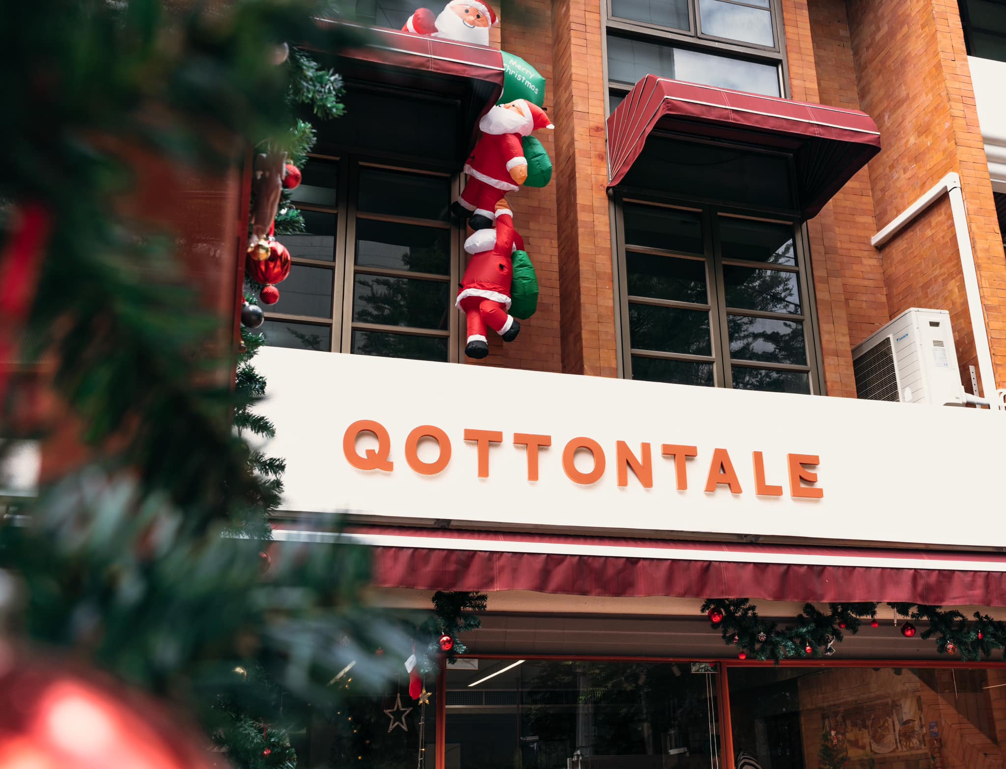
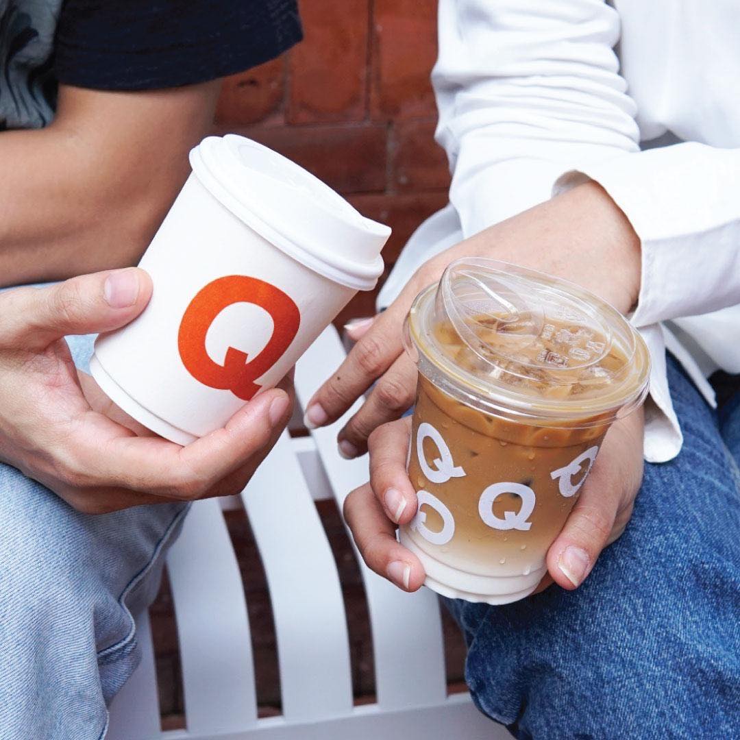
The logo is a lettermarks logo. We use a san serif font. Brands, today, have less time than ever to connect with their audiences and in doing so, try to make their messages as appealing, accessible, and digestible as possible. It’s obvious why the central modernist ideals of simplicity and efficiency prevail, and that sans serifs are ubiquitous as ever. From the reason above, the sans serif connotations of modernity and innovation help reinforce these perceptions, and as audiences, media, and the marketplace constantly evolve.
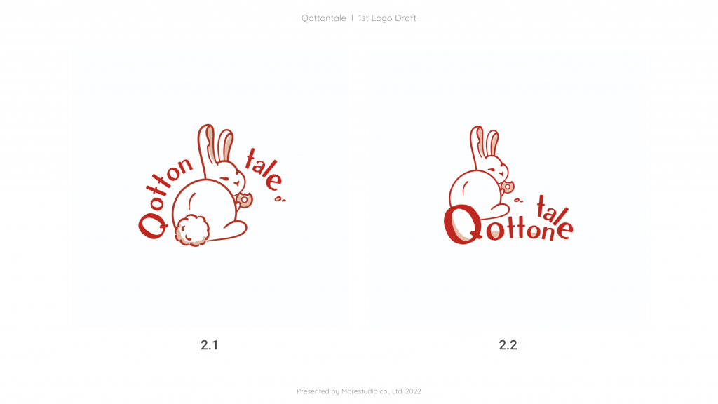
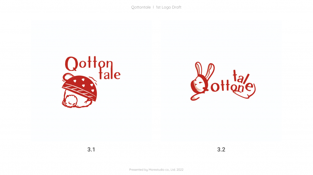
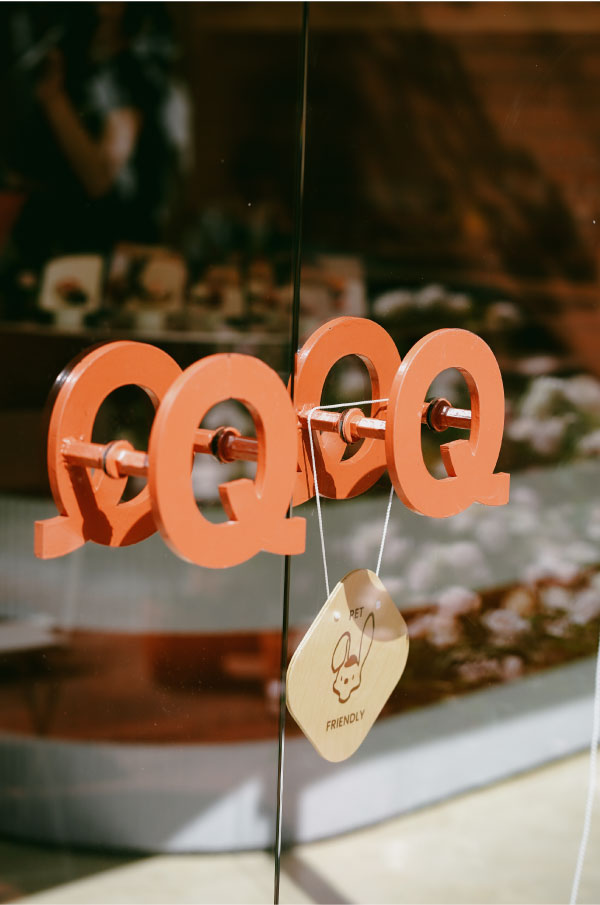
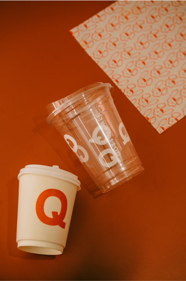
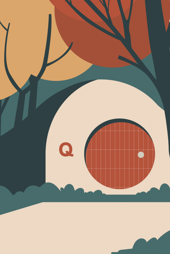
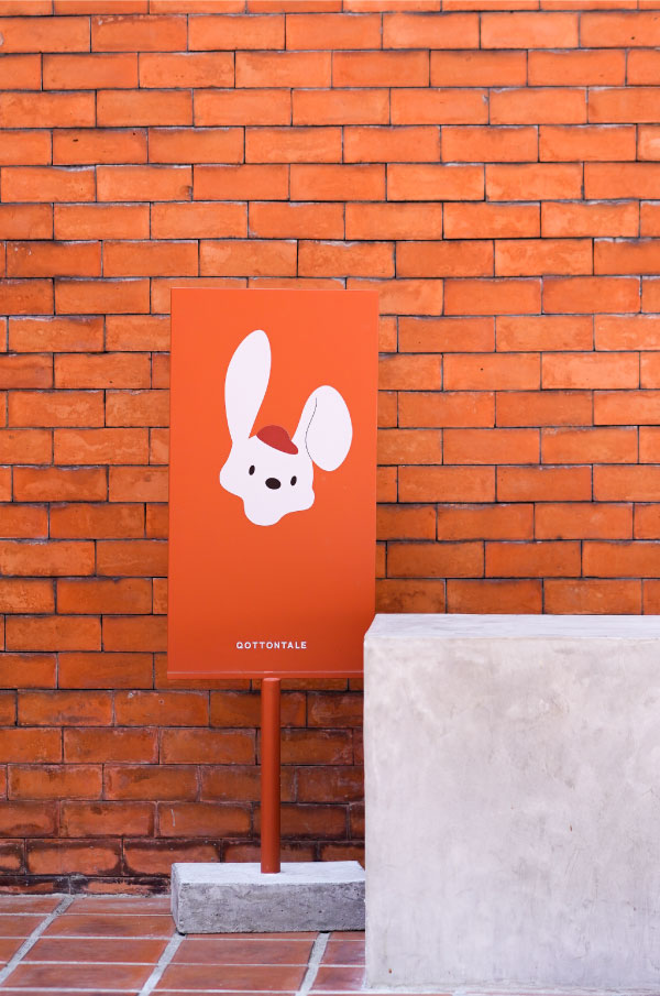
'Contton tail' is the name of a character from a novel, 'peter the rabbit'. It's also imply to a rabbit's tail.


Leave a Reply
You must be logged in to post a comment.